
When Website Navigation Fails Us
We've all been there. You land on a website, eager to find a specific piece of information or complete a simple task. But instead of a smooth journey, you're met with a confusing maze of menus, cryptic labels, and dead-end links. Frustration mounts, and you're left wondering, "Where am I? And more importantly, how do I get out?"
Poor website navigation is a silent killer of user experience. It's the digital equivalent of getting lost in a city without a map. In today's fast-paced online world, where attention spans are shorter than ever, a confusing website is a surefire way to lose potential customers or valuable readers.
What Makes Navigation Go Wrong?
Several culprits can contribute to a navigational nightmare:
- Overly Complex Menus: Drop-down menus with endless layers, vague category names, and inconsistent organization can overwhelm users. Simplicity is key.
- Lack of Clear Hierarchy: When information isn't organized logically, users struggle to understand the site's structure. A clear hierarchy helps users understand where they are and where they need to go.
- Inconsistent Labeling: Using different terms for the same concept or employing jargon that users don't understand creates confusion. Consistent and clear labeling is essential.
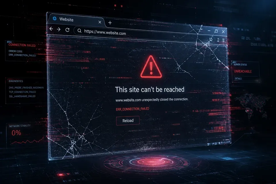
- Broken Links and 404 Errors: Dead ends are incredibly frustrating. They break the user's flow and erode trust.
- Poor Search Functionality: When users can't find what they're looking for through menus, a robust search function is crucial. If the search is inaccurate or yields irrelevant results, it's useless.
- Mobile Unfriendliness: Navigation that works on a desktop might be a disaster on a mobile device. Clunky menus and tiny buttons make it difficult for users to navigate on smaller screens.
- Missing Breadcrumbs: Breadcrumbs provide a clear trail of where a user has been, helping them navigate back easily. Without them, users can feel lost.
- Using breadcrumbs instead of site navigation: Breadcrumbs are used in addition to site navigation to help the visitor easily see where he is on the site. They should not be used to replace site navigation but to enhance site navigation.
The Consequences of Poor Navigation.
- High Bounce Rates: Frustrated users are more likely to leave a website quickly, increasing the bounce rate.
- Decreased Conversions: If users can't find what they're looking for, they won't make a purchase or complete a desired action.
- Negative User Experience: A frustrating experience can damage a brand's reputation and deter users from returning.
- Reduced SEO Performance: Poor navigation can hinder search engine crawlers, negatively impacting a website's search engine ranking.
How to Fix It:
- Prioritize Simplicity: Keep menus concise and easy to understand.
- Establish a Clear Hierarchy: Organize content logically and use clear categories.
- Use Consistent and Clear Labeling: Avoid jargon and use language that your target audience understands.
- Test and Iterate: Conduct user testing to identify navigation issues and make necessary adjustments.
- Optimize for Mobile: Ensure your website is responsive and provides a seamless mobile experience.
- Implement Breadcrumbs: Help users navigate back easily.
- Improve Search Functionality: Make sure your search function is accurate and efficient.
A smooth and intuitive navigation experience is crucial for success. By prioritizing user experience and implementing best practices, websites can avoid the pitfalls of poor navigation and create a positive and engaging online journey for their visitors. Don't let your website become a confusing maze; make it a welcoming and easy-to-navigate destination.